Okay…
Here’s the thing…
The first few issues of the comic have been available for less than a couple weeks, and more than once I’ve been asked the same question, “Why is it drawn like that?”
Usually this one is tossed my by people familiar with my less cartoony work like the stuff I did for the illustrations in Forts, or the insanely detailed pencil stuff I did in college, or well…I guess almost anything else I do.
The answer to why Pen Man looks the way it does is mostly simple: I like it.
Have I done “better” work? Sure.
More “technical” work? Probably.
Work where the human form actually resembles the human form and all the heads don’t have to point to the reader? Of course.
Here’s the deal, Pen Man and pretty much 90% of the characters in the Pen Man world were created when I was twelve. It’s why his name is so stupid. It’s why most of his villains are rip-offs/twists on Marvel and DC characters. It’s also why his head is always pointing at camera.
I was an idiot when I was twelve.
There are quite a few people out there that would probably claim I’m still a bit of an idiot, and I won’t flatly deny that, but these days I’m a different sort of idiot.
The reason I’ve kept the forward heads, and the funky proportions, and I haven’t changed the silly names is because that’s the way it’s supposed to be. Unique, or, weird, or just plain crummy (depending on who you’re talking to and how honest they’re being) it is the Pen Man “style.”
I’m comfortable drawing him this way. It’s nostalgic. It’s easy. I can lay in bed at night without a care in the world and draw something I’ve been drawing since I was twelve, the way I’ve been drawing it since I was twelve, and the way it’s supposed to be drawn.
Have a look at issue two from waaaayyyy back when.

Pen Man and Pen Mans Friend (yep, that’s actually what I named him) take on the menace of “Tank Man.” It’s pretty dynamic stuff. And by dynamic, I mean, hilariously crappy.
I also love it.
This is the way Pen Man looks, and as long as I’m drawing him, it’s the way he’s always going to look.
Don’t mess with the classics, even when the “classics” exist only in your mind.
Speaking of “classics,” next weeks pages will see the debut of a character my little brother created back when we were drawing comics side-by-side and racking up a nearly 300 issue run of our typing paper/stapled along the side, V1 of Novak Comics.
I don’t think my little brother ever really “loved” drawing. I think he liked writing the stories, and more than that, I think he liked just doing something with me. We both did. There was a fairly long period of time when we didn’t live together growing up. I was with living with my mother, he was still with my father. We saw each other from Saturday to Sunday every weekend, and we’d film a movie, or draw some comics, or something equally nerdy.
For the same reason Pen Man looks the way he looks, some of my brothers characters will be popping up over the course of the series.
With that in mind, here’s an original drawing of Poison he did from issue two of a little something called Sloth (Societies Last Option Towards Humanity) back in the day.
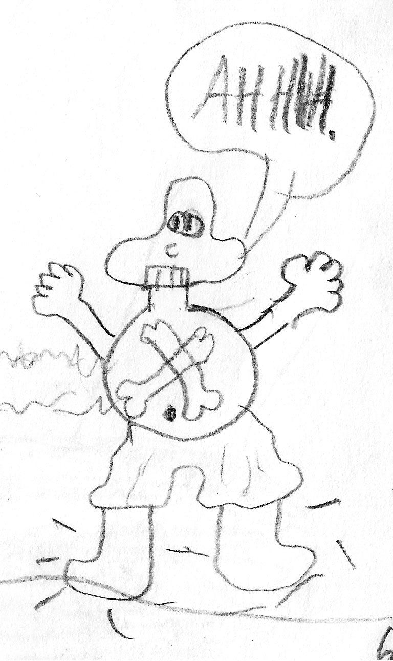
The head’s a little weird.
The teeth are weirder.
The costume leaves something to be desired.
It really is perfect.
If you’ve already seen the page I aded this morning, he looks mostly the same.
Because you don’t fuck with the classics.
-Steven
